
Guest Post from Kim Kohatsu – Director of Marketing at PickFu.
Product photos are the closest that e-commerce shoppers can get to experience your product before they buy it. Your imagery must be a suitable substitute for what a shopper might do in a brick-and-mortar store. Can your photos stand in for feeling a fabric through your fingers, sitting on a chair to test how soft it is, or smelling a perfume at the counter?
Your product photos need to impart practical information, such as size and color, but they also need to create an emotional appeal. How do shoppers feel about your product once they’ve swiped through the photos? Are they confident in your brand? Do they picture themselves using the product? Have you cultivated desire?
These tips will help you perfect your product photos and sell more products on Amazon.
1. Don’t skimp on the basics
Even on a shoestring budget, you can shoot beautiful product photography. “Since you spend thousands of dollars acquiring, designing, developing, prototyping and/or manufacturing your product, you want it to look its best, and the lens on the cellphone will not do it justice,” says photographer Peter Alessandria.
It’s worth it to invest in basic equipment:
A Decent Camera: “Buy (or borrow) a great entry-level, interchangeable lens camera, such as a DSLR,” Alessandria says. “I bought my 10-year-old niece a refurbished Canon Rebel SL-1 (including lens) from the Canon USA website for less than $300, and I could probably do 80% of my professional work with this camera if I had to. Afraid of using the wrong settings on your fancy new camera? Shoot in automatic mode, and the photos will still be stunning.”
A Simple Light Kit: You can purchase an inexpensive light kit for about a hundred dollars. You can even set up desk lamps or work lights to create lighting effects. “The key to good lighting,” advises Alessandria, “is to use at least two lights and place them to the left and right of your product. Never light the product straight on. Play with different angles to see what looks most interesting.” Do not use the built-in flash on your camera. “Direct flash is the most unflattering light for both people and products,” he says.
A Background Texture: For a smooth, sweeping look, buy a white drawing or tracing paper on a roll (sold at art stores and online). Put the roll high up on a shelf and let it drape down over your shooting area.
2. Treat your photos as mini-ads
Overlaying text and graphics on photos is an effective way to point out product features and important details. Here are some examples.
Use overlayed text to list product benefits:

Call attention to what comes included with your product:
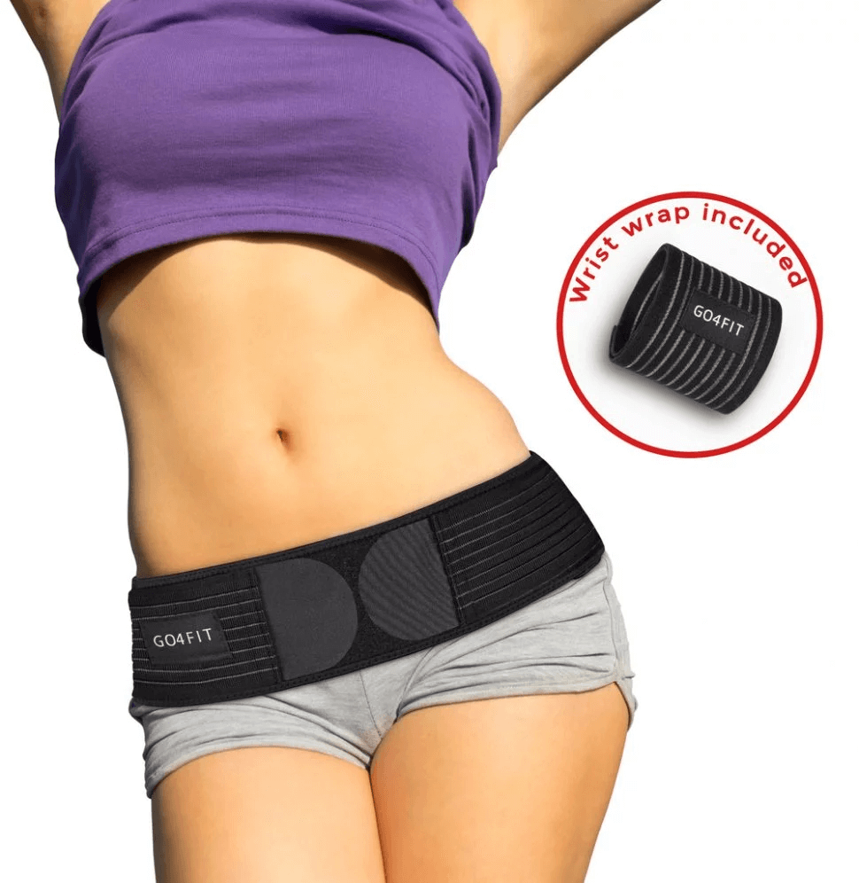
Use graphics to illustrate features:

3. Choose the right main image-ads
Your product’s main photo may significantly affect its click-through rates on Amazon. Therefore, choosing the image to feature should not be left to chance. Instead, get quantifiable results through Amazon split testing.
To run a split test, you could swap out a featured photo after a few days and compare the results. Or, for even faster results, use PickFu.
PickFu is an instant polling service where you can ask questions to people who resemble your target market. PickFu helps you understand what shoppers are drawn to and how they react to your product — all in a matter of minutes.
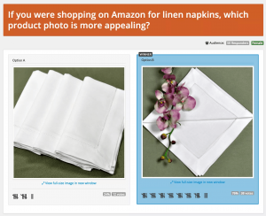
Steve Chou, the owner of Bumblebee Linens, tested two product photos using PickFu. In less than 20 minutes, he saw that 50 female poll respondents preferred a new photo over the old one by a 3 to 1 margin. When Steve updated his listing with the new photo, sales of the item jumped 209%.
PickFu helps you uncover potential issues with your brand imagery, too. Respondents will make you aware of problems you might not have foreseen. For example, in this poll, an e-commerce seller asked 50 women to choose which photo they preferred for a set of exercise bands. Both photos showed the bands and their storage bag, but Option B featured a photo of a ballerina using a band to stretch her leg, while Option A showed only the ballerina’s leg.


Respondents showed a strong negative reaction to Option A and its disembodied leg. “A phantom ballet leg just hanging over a product is creepy,” one of the women said. Other negative words that respondents used: random, weird, odd, strange, and awkward — not sentiments any Amazon seller wants to be associated with their product.
As easy as 1-2-3
Stunning product photography is a three-step process. First, invest in the right equipment (or the right professional photographer) to set you up for success. Then, when you have an array of product photos to choose from, work with a designer to bring the photos to life. Use text and graphics to call out product features and attributes and make your images even more attractive. And finally, test your product photos to see what customers like. See what draws their attention and use their insights to guide your photo choices.

0 Comments